
If it isn’t seen on mobile, is it even really seen? Today, 34% of active users access their social media accounts via their mobile device. That’s why optimizing your social content is crucial. If you want to start a conversation with your mobile audience, you need to make the effort to reach them there.
How to Optimize for Mobile
Make It Eye-Catching
The most important thing to remember here is that you want users to STOP SCROLLING long enough to check out what you have to say. If it doesn’t pop, it’s not going to engage or interest your audience.
Keep in mind that social media is ultimately a visual-based media. Most audiences would rather see pictures and video than read long-form text in their newsfeeds. So, if you’re promoting a blog post, you want to have an appealing featured image as well as a catchy headline to grab attention.
Along the same lines, you want to make sure your graphics are attention-grabbing as well. Use colors, fonts, and backgrounds to your advantage, without making the graphic look too busy and headache-inducing.
Canva has plenty of ready-to-use templates for quickly creating visually stunning graphics. No photoshop experience required.
The size of your graphic matters, too.
Different sizes look different on each platform, so here are my recommendations for optimal graphic sizing:
For a standalone graphic, many different sizes work on both mobile and desktop. The important thing is to stay consistent. Personally, I prefer graphics that are 1024×512 (pixels, or px), which easily fit on mobile screens without cutting off any of the graphic. If you are uploading a photo as a single featured image with a link, 1024×512 is also an ideal size. You can, however, use multiple images in a “carousel” for your link preview images. For this, use square (800×800) sized graphics.
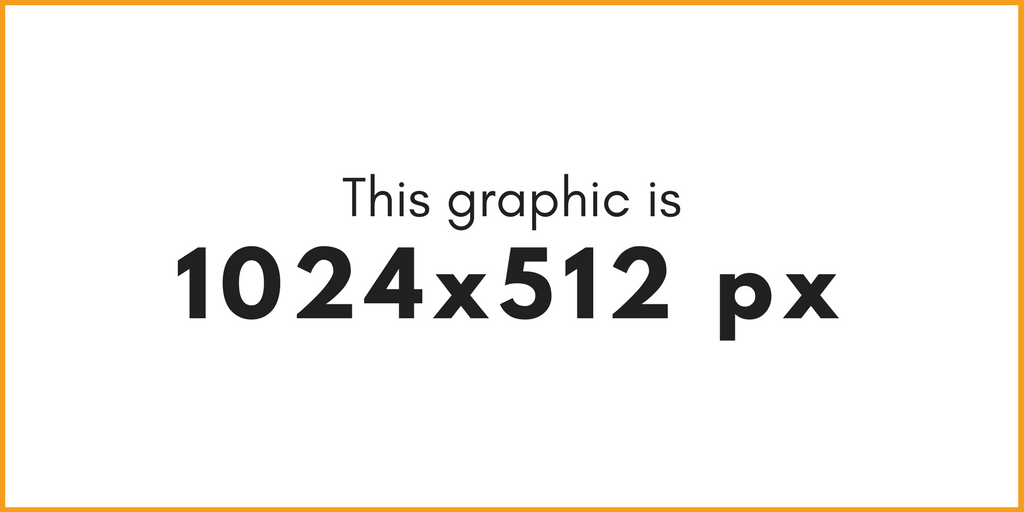
Like with Facebook, the preferred graphic size here is 1024×512. Mind your edges, though, because elements too close to the sides can get cut off. When in doubt, keep it centered.
Even though Instagram lets you upload pretty much any size photo nowadays, keep your graphics to the standard square (800×800). But, be mindful of using too many “made” graphics. Organic photos always work best on Instagram
Yes, there is an optimal size for LinkedIn graphics. And again, it’s 1024×512. (I’m really making this easy for you, aren’t I?) If you haven’t been on LinkedIn lately, go check it out. Square graphics don’t work on this platform anymore. In fact, they are cut off on mobile and squished on desktop. Stick to the 1024×512 rectangle (and keep elements away from the edges) and you’ll be good to go.
Make It Personal
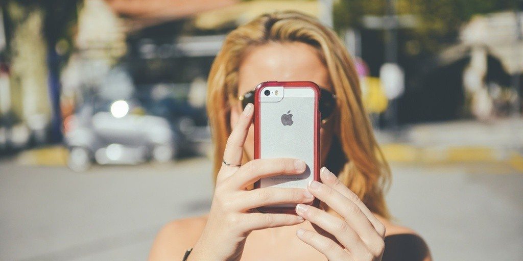
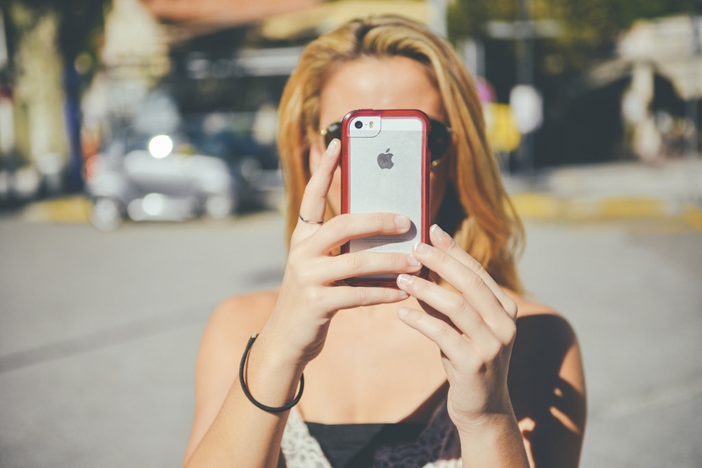
Most stock photos are BORING. Your audience wants to see the personal side of your brand as much as possible. As often as you can, use organic photos of your business – products, staff, office, etc. If you can, take your own “stock” photos. If you do need to use stock, check out free stock photo sites like Pixabay and Pexels for photos that look more organic and less staged.
Make It Brief
Social media is fast-paced. Your audience wants to be able to quickly see your post, understand what it’s about, and continue through their feed. If it’s right, they’ll like, favorite, or share it. If they’re really intrigued, they’ll click to learn more. But you need to give them the option to quickly move forward. For the same reasons you don’t want to overwhelm users’ feeds with too many posts, you also don’t want to overwhelm them with too much text.
My best advice is this: put the main, important point on the graphic, and back it up with additional post text. Brevity is your friend. If your audience wants to learn more, they will look to your website and blog. You don’t want to force them to learn more. That’s the quickest way to get unfollowed.
Now, it’s time for you to audit your social media accounts. Are you using the correct sizes of graphics? Do your graphics quickly make your point? In the age of mobile, it’s important to get your social posts right.