
Selecting a font for a post or graphic can be a daunting task. For some, it may be something that’s not given a lot of thought. The tone of your typography selection could be what makes a potential customer linger longer on your graphic, or just quickly graze past it without much consideration. It’s just one component to your success in inbound marketing, but an important one. When making your next graphic, ask yourself, “What tone am I communicating in my font selection?” 
Type mirrors the way our handwriting communicates our mood. Think back to when the last time you wrote by hand… don’t panic, but this may take a minute or two… Can you remember what it looked like? Maybe it was scratchy or italicised because you were quickly jotting down a thought. Maybe you were angry and applied a little more pressure to your pen therefore it became bold and deliberate.
Our emotions influence how our handwriting looks. The same concept applies to typography. Font selections can directly influence the emotions of our readers. Think about it… you have the power to select a font that can actually create an emotion! That gives typography a lot of power and influence. What emotion or tone are you trying to communicate to your readers? Careful, next time you select a font, make sure it’s the right one.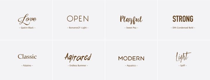
How do I select the right font?There are many factors in selecting a font, but we will just stick to the concept of “tone” for this post. Here are some pointers to consider:
- What emotion is paired with each font? Understand how to interpret a font and what emotions could be associated with it. The diagram below can give you a starting point. Lynda.com also has a great video that dives a little deeper into this concept.
-
What emotion do I want my audience to feel when reading this? Consider your target audience and what emotion would best draw them in.
-
Does this font selection coincide with the tone of my overall brand? You don’t want to send mixed messages by selecting a font that is out of character of your brand. The tone should be consistent across all social media platforms. For more on developing a strong visual brand, try this article from Hubspot.
Typography within your graphics can be quite the powerful tool, but it’s all just a small part of effective design. Next time you design, post, tweet, or pin, take a second look at the tone you’ve created. Follow the three guidelines suggested, and begin selecting your fonts with intention!