
easy reading and navigation with a minimum of re-sizing, panning, and scrolling.” With that being said, it should come as no surprise that these changes in web design means that there is an importance to it. Let’s take a look at some key factors:
 1. Google Rewards A Responsive Design
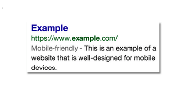
Google prefers responsive web design because content that lives on one website and one URL is much easier for users to share, interact with, and link to than content that lives on a separate mobile site. Google states that responsive web design is its recommended mobile configuration, and even goes so far as to refer to responsive design as the industry best practice. So why is this important? Google not only recommends responsive design as the best way to target mobile users, but also favors mobile-optimized sites when presenting results for searches made on a mobile device.
2. SEO
There are many other factors that play a key role in improving your SEO, but responsive design is something that cannot be ignored, and without it your SEO picture will be incomplete. If you have separate desktop and mobile sites, you’re going to have to run separate SEO campaigns for each. With a responsive design, you keep the same URL for both desktop and mobile sites, saving you the hassle of wasting time needed to create, maintain, and analyze two seperate SEO campaigns for one website.
3. User Experience is Enhanced
Desktop users who are accidentally sent to the wrong site version and who can’t find the information they are looking for will become dissatisfied, leaving the site to continue their search. Frustration can also occur for websites that aren’t optimized for mobile. Responsive design can solve these problems by presenting content in a functional way without compromising what you choose to display on various devices. Presenting all your content to users in an approach that is easy to view will ultimately keep users on your page.
An optimized and consistent site, no matter what platform it’s viewed on, provides a better experience for the user which is more likely to lead to them engaging with you than going elsewhere. Furthermore, optimizing your site no matter what device the user chooses makes their life easier. Happier customers means a happier business.
If your aim is to minimize hassle, extra work, and frustration, then a responsive web design is the right choice for you. To put it simply, if Google takes into account whether a site is responsive and optimized over numerous platforms, and rewards one for doing so, then it is probably in one’s best interest to go ahead and enhance your website across the devices that people are mostly likely to use. Smartphones and other platforms besides desktops are being used to search the online world these days, and that should not come as a surprise. So take these key factors into account, and make sure to invest in a responsive web design for your business, it’s a decision you will not regret.