
Selecting fonts that compliment one another can be tricky, and although pairing type is fun, it runs a high risk for mistakes. In the design world, rules can be bent and broken; however I do have a few tips that will guide you in how to happily marry fonts, and send you on the way to blissful design!
Begin your journey of pairing fonts like a pro with these 4 steps:
1. Contrast
You want your selections to compliment one another. They can’t be too similar, but neither should they be so different that they clash. Some may say it’s like relationships, meaning opposites attract! A font with a lot of personality, style, or uniqueness would be paired well with something more neutral, simple, and conservative. Some design elements to consider when looking for fonts with contrast are size, weight, style, spacing, kerning, leading, and color just to name a few!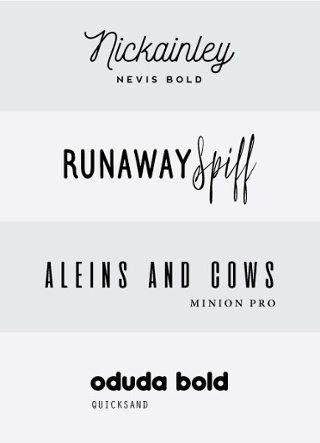
Let’s take look at the first block. “Nickainley” is a graceful font with curved lines and large size. It complements the subtle font “Nevis Bold,” contrasting elegantly with the straight lines and smaller type.
Be careful here. Differences in size will not necessarily be the success to pairing fonts. The second block contains two fonts of the same size, but a clear difference in style.
Would “Nickainley” and “Spiff” be a good match? Under the right context perhaps, but just to play it safe I would advise against this. Both are script fonts with similar characteristics in line quality, tone, and height. Remember, contrast is the secret ingredient to happily paired fonts!
2. Keep the number low
Limit the number of fonts in a design. Playing it safe, your best bet is to keep the selection to 3 or less. Like I said in the beginning, rules can be broken! Although certain projects may call for more, in the end, your overall goal should be harmony not clutter.
3. Hierarchy
Layout isn’t the only design element that can establish hierarchy. Fonts can easily do the same job. Your chosen fonts will need to each have their own “job” or purpose to create a clear hierarchy. Decide on what information is essential. Your selection should make that content stand out at first glance.
4. Have a Purpose
Before pairing fonts, ask yourself “Do these convey the purpose of my design?” When browsing fonts, it’s easy to get caught up in the volume of choices. Don’t let personal style or preference get in the way of what’s appropriate. Is the selection supporting your brand? All font choices should communicate the purpose of your design and align with your brand’s overall tone.
At the end of the day we want our content to be read; therefore, function weighs more than the aesthetics of font, even though the look is what captures attention. Of course, type should pleasing and eye catching, but purpose takes priority.
The next time you’re creating a graphic, designing a web page, or posting a blog, remember these four steps. Rules can be broken, but under the right circumstance and context. To ensure a successful fit, ask yourself if they’re fulfilling their purpose in the design. Are the number of font choices appropriate and functional? Is there an established hierarchy and enough contrast between fonts? With these questions as a guide, you’re well on your way to better design and more compelling content. Happy pairing!